ONBOARDING EXPERIMENT
PURPOSE
Matter’s onboarding experience was originally in the web app and then redirected users to Slack. While the web app onboarding had high conversion rate, we moved the experience to Slack hoping to streamline the experience (prevent users to having to jump from one application to another) and to reduce bugs. We would run an experiment with 75 (control) : 25 (treatment) split to determine if this would be as successful.
Target user:
Primary: New users signing up for Matter, which we referred to as admins.
Secondary: New users that admins invited to use Matter with.
MY ROLE
Lead UX design
Partnered closely with Product Manager on defining MVP and scope
Collaborated with Dev team
Helped QA
Post release monitoring
PROCESS
INSPIRATION
Matter’s web app onboarding had went through several iterations of onboarding and the latest version had a high conversion rate. We wanted to keep the flow that worked with the latest version but make sure it fit with Slack’s UI framework.
Onboarding steps in latest version:
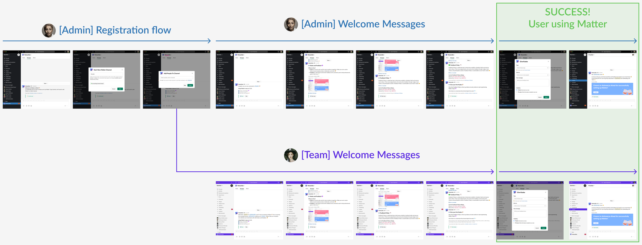
Connect Matter to Slack workspace
Create a Slack channel that would post Kudos and announcements
Add people to the channel created in previous step
Web app Onboarding
EXECUTION
I was able to recreate the onboarding screens using Slack’s UI Framework. I also used Slack’s Block Kit Builder to build the messages. This is an extra step I took whenever I worked on Slack apps, this helped me get an actual representation of what it would look like in Slack and it also helped out the developers so they wouldn’t have to build these messages themselves. While there were some technical limitations with Slack and I had to alter some of the steps, I was able to closely align with the web app experience.
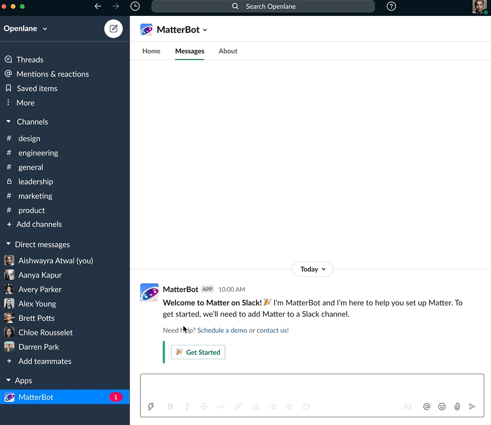

Slack Onboarding
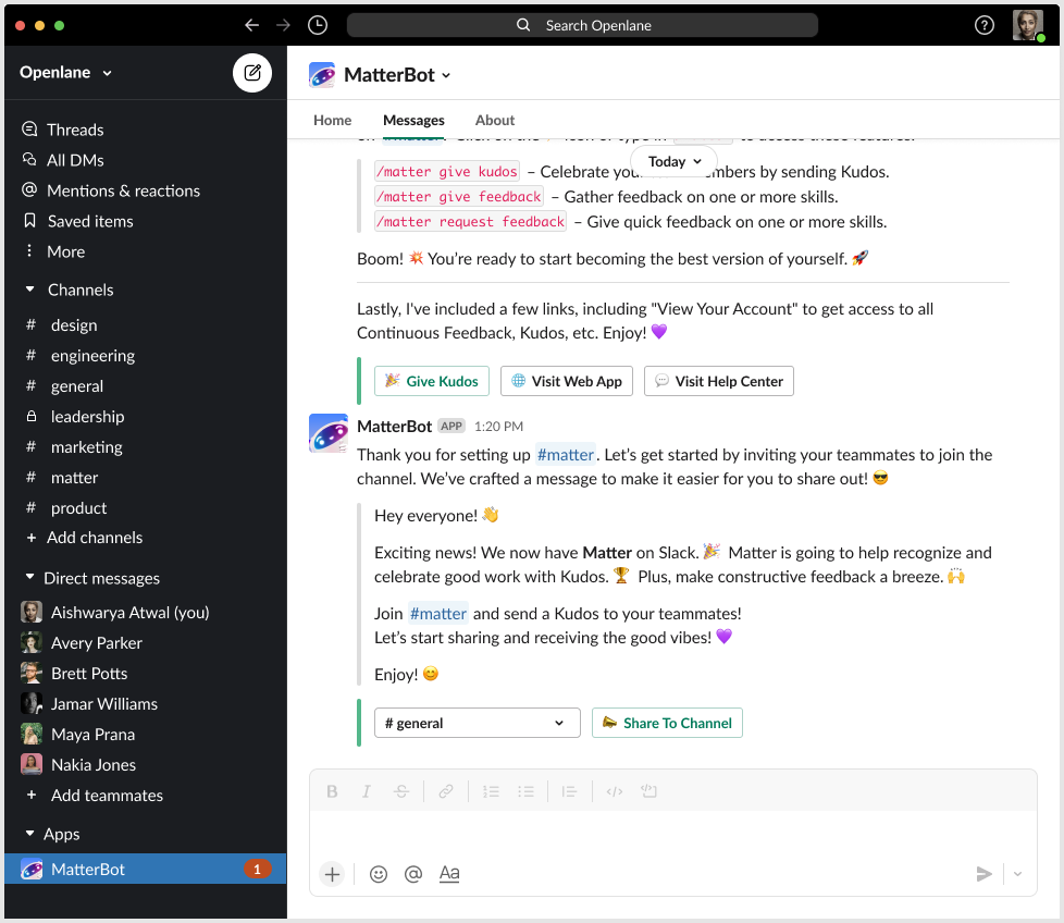
BACK TO INSPIRATION…
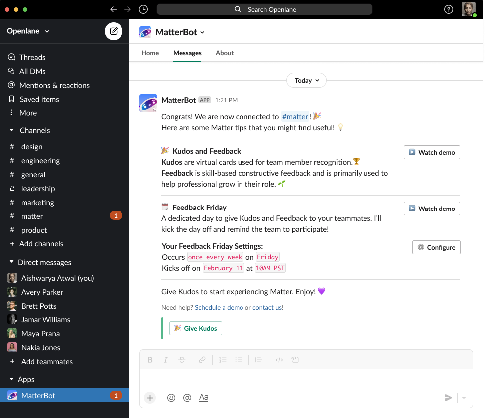
However after taking a look at the whole experience from sign-up to first time user experience, I realized that our welcome messages were disjointed and unhelpful. Some messages were in the public channel, some were in the MatterBot DM.

We also saw some feedback from customers come in about not having any idea how to use the app.
“It was a very confusing experience, I had no idea what to do after I went through onboarding so I just removed the app entirely.
A big part of Matter’s success was having an advocate to introduce this new culture practice of feedback. We needed to provide our admins with a streamlined welcome experience so they would start using Matter. Once admins started giving Kudos, the rest of the team would see what Matter is all about and start engaging with the app.
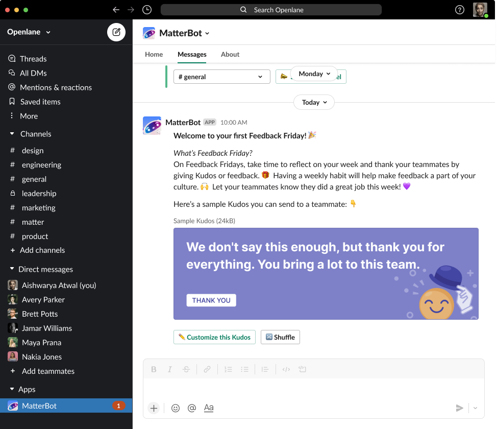
I took this back to the Product Manager and was able to turn this into Phase 2 of this project. To figure out how we would measure success, the PM and I looked at the month over month attrition. Current reduced MoM attrition was 14%. Our goal was to bump the number up to 10%. Another goal was making sure we take registered users into active users. We needed teams to enable the Feedback Friday feature, which is a scheduled day to give Feedback and Kudos to each other. Feedback Friday would help increase the amount of Feedback and Kudos given, since we announced the start of Feedback Friday, had reminders and a recap to celebrate those who participated.
EXECUTION PART 2
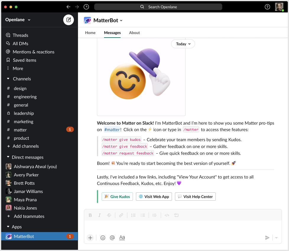
I took a look at the current messages and the information we were giving our users. I went back to the drawing board to identify what information we need to provide to allow teams to have a successful experience with Matter. I gathered this information by collaborating with the growth team based on what kind of questions they heard in demo calls.
FTUE checklist that I put together:
Explain Feedback Friday
Configure Feedback Friday Settings
Explain how Kudos and Feedback works in Matter
Video demo
Links to Book a Demo and Contact Us
I created 2 options of FTUE messages that included everything from the hit list. One version was providing all of the information up front and another was more of a conversational checklist, they would learn one thing and click next to move on to the next. We decided we would run a 50 : 50 experiment to see which version performed better. We would determine the winner by comparing metrics, e.g. if they clicked on the final “Give Kudos” button (engagement,) retention, and if admin invited team members to the Matter channel.
Version 1: All Up Front

Verison 2: Conversational checklist
Onboarding flow is streamlined and now a linear path
Dev Handoff
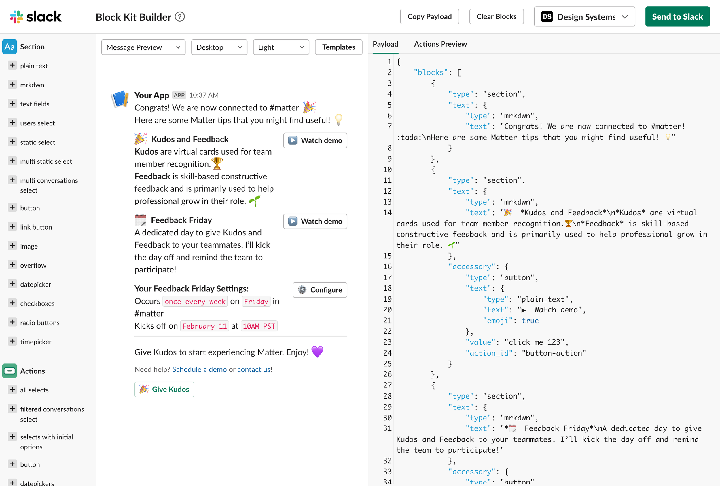
Along with a Figma file to show the flow of the messages, when I worked on Slack projects, I prototyped each message using Block Kit Builder, Slack’s sandbox. This helped us see messages accurately and to see if designs were feasible since Slack’s UI framework is limiting.
Samples of Block Kit Builder provided to dev:

In addition to the Block Kit Builder and Figma file, I provided detailed documentation for dev to follow: Plan of Record
This doc was used both for Dev and QA teams.
CONCLUSION
We first launched the onboarding experiment as Phase 1 of this project. The experiment was successful we saw metrics that were comparable to the web app experience. We were confident we could safely move the sign-up flow over to the Slack experience.
For Phase 2, we launched the Welcome Message experiment. We saw improvement in the results, both versions performed better than the current welcome messages. Conversational Checklist version performed slightly better, attrition rates were higher and people in that cohort gave more Kudos. and that was implemented after the experiment.

Experiment Results
LEARNINGS
Avoid making users jump from one application to another, having a streamlined experience contributes to a better experience.
It always worth it to go the extra step to provide team with designs, documentation, and prototype. It helps the team see the end to end flow, understand UI behavior, and speeds up process.
Even if it’s a small project, look at the bigger picture, it may be a bigger project than you think.