ANALYTICS LANDING PAGE
PURPOSE
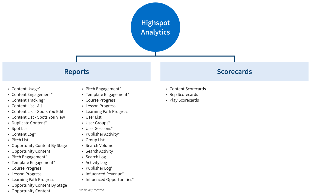
Highspot's Analytics Center lets you access engagement, content, and rep performance data - and take instant action. Scorecards and reports are the two main features that Highspot Analytics offers. Analytics reports allow you to view configurable data on your go-to-market effectiveness and are customizable. Scorecards offer insights into go-to-market performance through chart visualization. Highspot has about 35 report types and 3 types of scorecards: Content, Play, and Rep. However, reports and scorecards were not getting enough usage and we hypothesized that it was because of poor discoverability. Our objective was to make it easier and quicker for users to find reports and scorecards.
Starting state:
Poor discoverability - Difficult to navigate and find scorecards. Clicking on Analytics in the navigation took you to the default report.
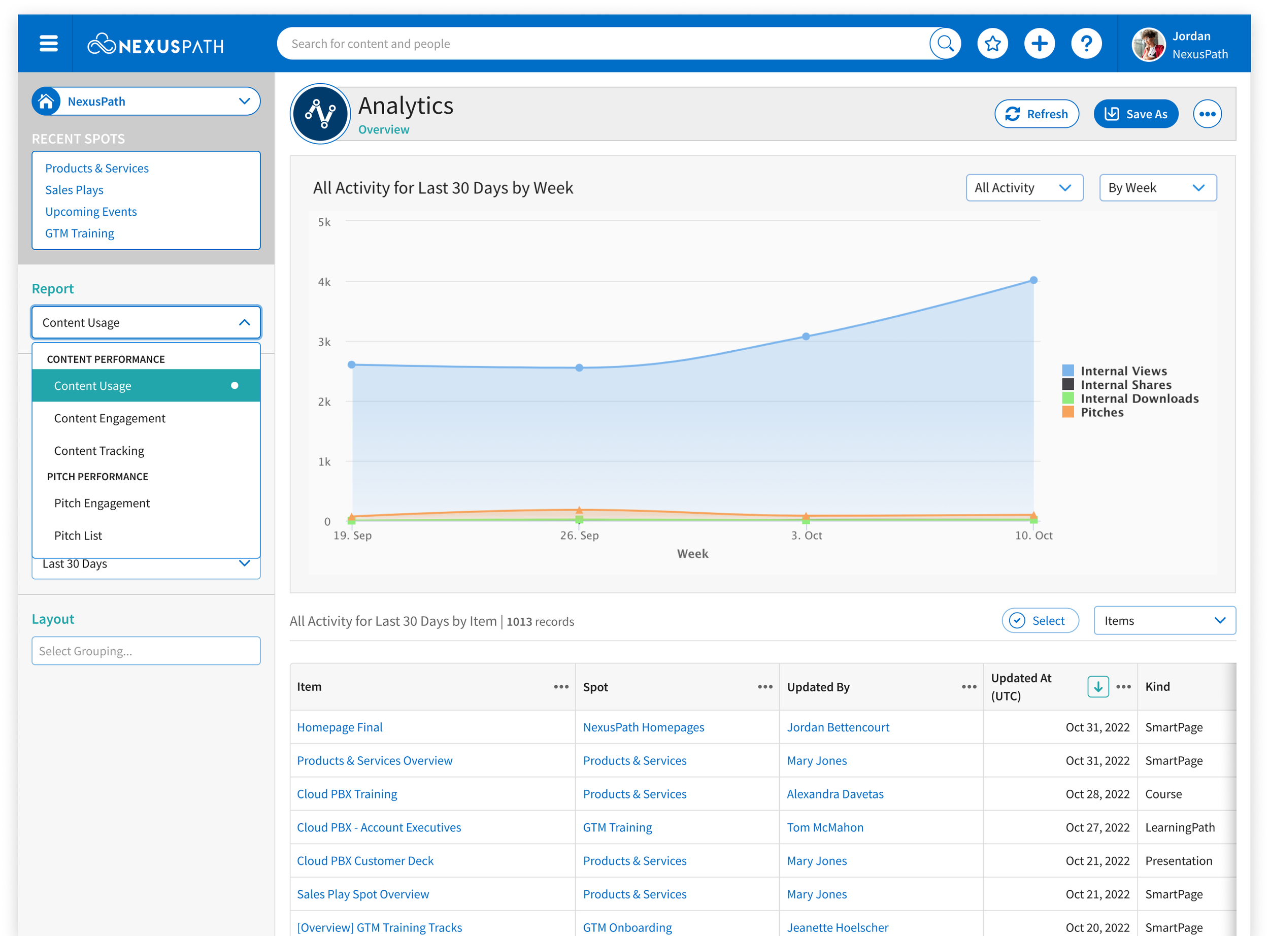
To see the full list of reports, users needed to open the select menu and scroll until they found the report they needed. All users land in “Content Usage” report on default which makes data on report usage is skewed.
Scorecards are not located in Analytics and are buried in the product, requiring multiple clicks and relying on users to know exactly where to navigate.
No guidance provided to help users find the report they need.
Too many reports that are not well differentiated
Lack of customization and personalization
Assumes all users have the same data.
Not much of a landing page…
Flow to get to a scorecard…

Content Scorecard
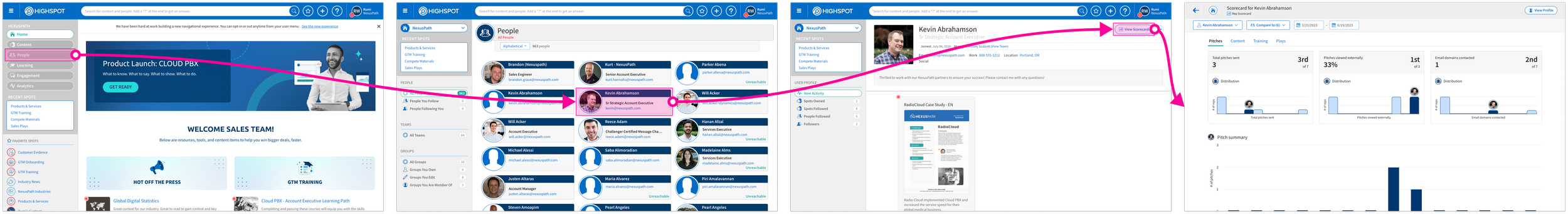
Rep Scorecard

Target users:
Analysts: access to all reports and scorecards
Non-analysts: access to some reports and scorecards
MY ROLE
Lead UX design
Partnered closely with Product Manager on defining MVP and scope
Collaborated with cross-functional team including engineering, visual design, product marketing, etc.
Assisted with QA efforts
Post release monitoring
PROCESS
Our objective for the MVP was to create a platform that allowed for continuous evolution. First we identified what the north star vision could look like:
Provide user with a guided experience that lead them to the appropriate report or scorecard
Allow customization so each user has a landing page that best fit their needs
Empower users with data insights in a real-time cloud based dashboard
Provide a summarized view of their reports and scorecards
Access it from anywhere - computer, tablet or phone
AI smart search allowing users to search for and find the best tool for the job
After identifying some north star goals, we narrowed down the scope of the MVP. We wanted to take a click stop approach so we can apply learnings with each update. For the first click stop, our goal was to improve discoverability of current reports and scorecards to increase adoption rate and to increase MAU. As of September 2022, 3,120 users accessed reports.
This landing page project was started previously by another designer before I joined the company but after changing priorities and conflicting stakeholders, the project was put on pause. When this project was ready to be resume again, I was assigned as the designer to use my fresh eyes and perspective. The Product Manager and I reviewed recordings of previous meetings, previous documents and designs to understand the history.
I also took a look at our current list of reports. We were also in the process of migrating reports from EQL to GraphQL and some reports were scheduled to deprecate. I mapped out a spreadsheet of all of our reports to help visualize which reports were being deprecated, user permissions, and to come up with categories that made more sense. I partnered closely with the Product Manager and Product Marketing during this time.

EXECUTION
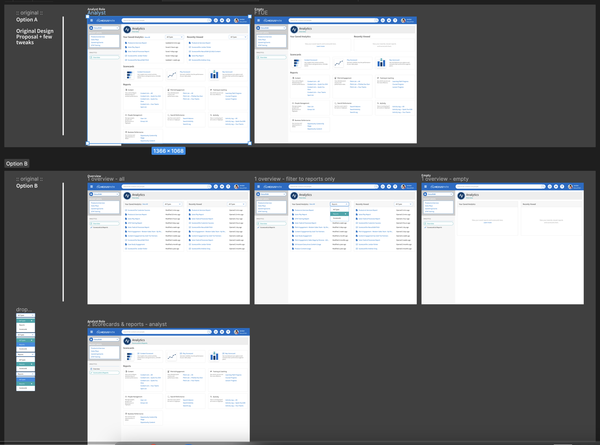
After collecting information and brainstorming, I put together a first design. I added recently viewed section up top and then a section of quick links to scorecards followed by a section of links to all report types. I thought adding a recently viewed section would also help with users finding what they need quickly. I also reached out to a visual designer to help work on product illustrations. Highspot had never used product illustrations in the product before, I wanted to push the envelope a little to help modernize the outdated UI. From our lost opportunities feed, I noticed that our outdated UI is often listed as one of the reasons why we lost a prospective customer.
I gathered feedback from my team from all functions to see what their thoughts were. Overall I had positive feedback and there seemed to be a lot of excitement around my design. However when I presented the design to the leadership team, I got pushback from the CEO. His argument was that Highspot’s CMS should be enough and that we don’t need a recent section. After some back and forth the CEO wanted to see the recent section as the landing page and then list of scorecards and reports to be on a different tab. The Product Manager and I felt that this suggestion defeated the purpose of the landing page because our goal was to improve discoverability. The Product Manager and I recruited our UX Researcher to help us validate so we had data to push back with. After conducting some usability tests, having everything under one page tested better, we had a 100% success rate on users successfully being able to find scorecards and reports. We were able to take this research data back and move forward with our design.
HANDOFF
I made updates from the feedback we got from research and put together the final iteration of the design. I worked closely with the engineers during development cycle. I handed off a Figma file and detailed design documentation for engineers to follow.
The final Landing Page now allows users to access scorecards and reports directly with easy access to recently viewed items.
Reports that will be deprecated are in a section below. I am collaborating with Product Marketing on how to sunset these reports. We are working to provide our users with a seamless transition from an old report to a newer and powerful report.

RELEASE
We released the new Landing Page in March 2023. The response was overwhelmingly positive. We saw usage of reports and scorecards spike after release. We also saw positive feedback come in from customers.
“[Speaking about the new Analytics landing page] I like this! This is so much easier already, I would drill down and find the sub categories. I can tell you already I like this layout better”
- Sales Enablement Manager @ Rakuten
We are still monitoring data and customer feedback and getting ready to start the click stop 2 designs. For click stop 2, our goal is to provide more guidance so we can set our users up for success. One thing I’d like to focus on is the empty state for the landing page and scorecards.
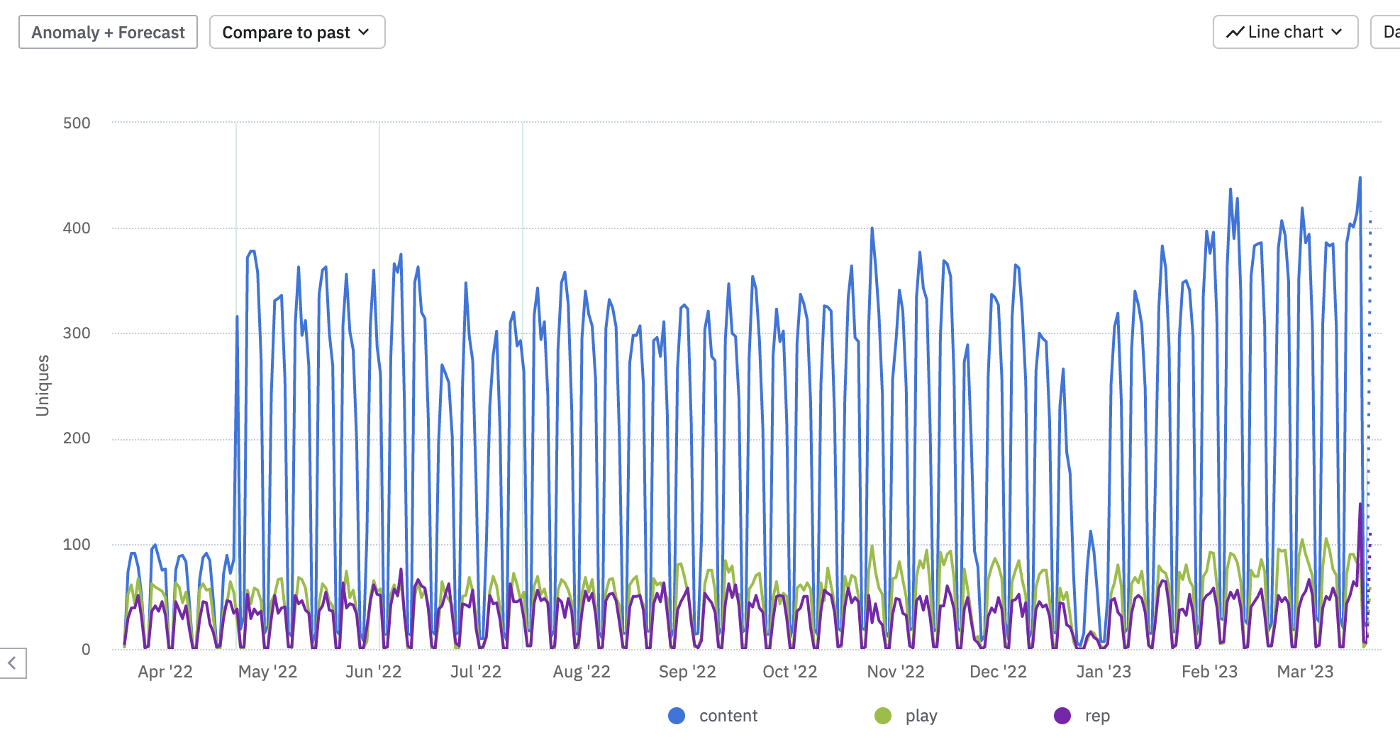
Highest daily usage on Content and Rep scorecard the Friday immediately after release. Rep scorecard got more than double the daily average usage!

We saw a ~20% increase in scorecard usage due to increasing disccoverability.