


/
1
2
3
4
5
6
7
·
·
·
·
·
·
·
Predictive Content Creation allows Salesforce Marketing Cloud customers to develop predictive recommendations for their emails or websites. A proposed redesign aims to streamline the existing disorganized flow by introducing a structure that accommodates users with different levels of expertise, incorporates the latest Salesforce Lightning Design System, and enhances the overall user experience of the product.
I served as the UX lead for this project, where I created both low and high fidelity prototypes while also mentoring another UX designer. Collaborating closely with a UX researcher, we crafted a comprehensive user experience utilizing insights gathered from interviews, user walkthroughs, and various research methods. I fostered strong relationships with key stakeholders to clearly define the project by interpreting and conveying customer insights. Additionally, I maintained regular communication with development teams to ensure transparency and to verify that the designs were technically feasible and aligned with the project timeline.
The UX team employed a human-centered design approach for this project.
I worked closely with the UX researcher throughout the entire project. We identified the personas we were designing for, their processes, and their pain points by conducting interviews with the services team. Since the service team engages with our customers daily, it was crucial for us to grasp how our customers use the product, the challenges they face, and the new functionalities they wish to see integrated.
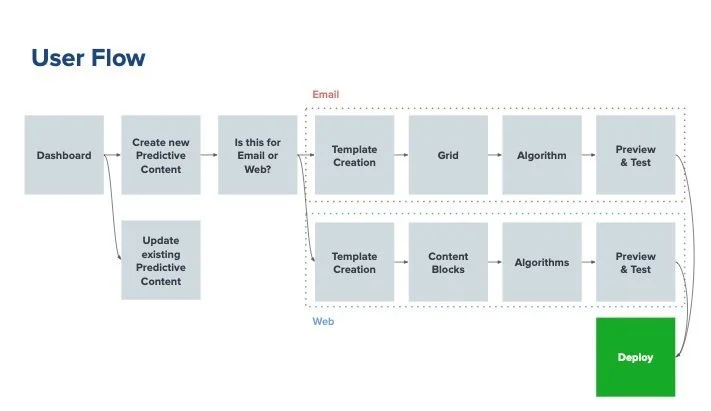
Using the knowledge we gained from the services team members, we came up with a user flow. The current product lacks any kind of flow, we determined that providing a clear step by step flow would help increase the usability. To determine the user flow, we did some whiteboarding and sketching based on some heuristic evaluations. This exercise helped to identify all the steps that user must go through.
Using the Salesforce Lightning Design System, I developed a prototype that showcased the new flow along with the visual studio. Tools such as Sketch and InvisionApp facilitated this process. We conducted several rounds of user walkthroughs involving participants to assess the effectiveness of the new visual studio designs. Our objective was to understand the experience difference for returning users and to find ways to support individuals with varying levels of expertise. Additionally, the studies aimed to evaluate the adoption of normalized terminology while moving away from industry jargon.
The findings indicated that the visual studio was well-received, and we significantly enhanced ease of use ratings by normalizing terminology, establishing a straightforward flow, and providing assistance in areas needing extra context. We took the feedback from the walkthroughs into account, implemented suggested changes in our designs, and continued to iterate and test until we achieved a satisfactory level of ease of use. The final designs received a score of 6.25 out of 7.
Throughout this process, I collaborated closely with the development team, participating in scrum meetings and providing demos to ensure transparency. My aim was to design a product that was both technically feasible and aligned with the targeted release date. After finalizing the designs, I conducted a developer hand-off review to present the prototype and address any questions. The developers also engaged in design reviews after completing each ticket to ensure that the implementation conformed to the original designs.
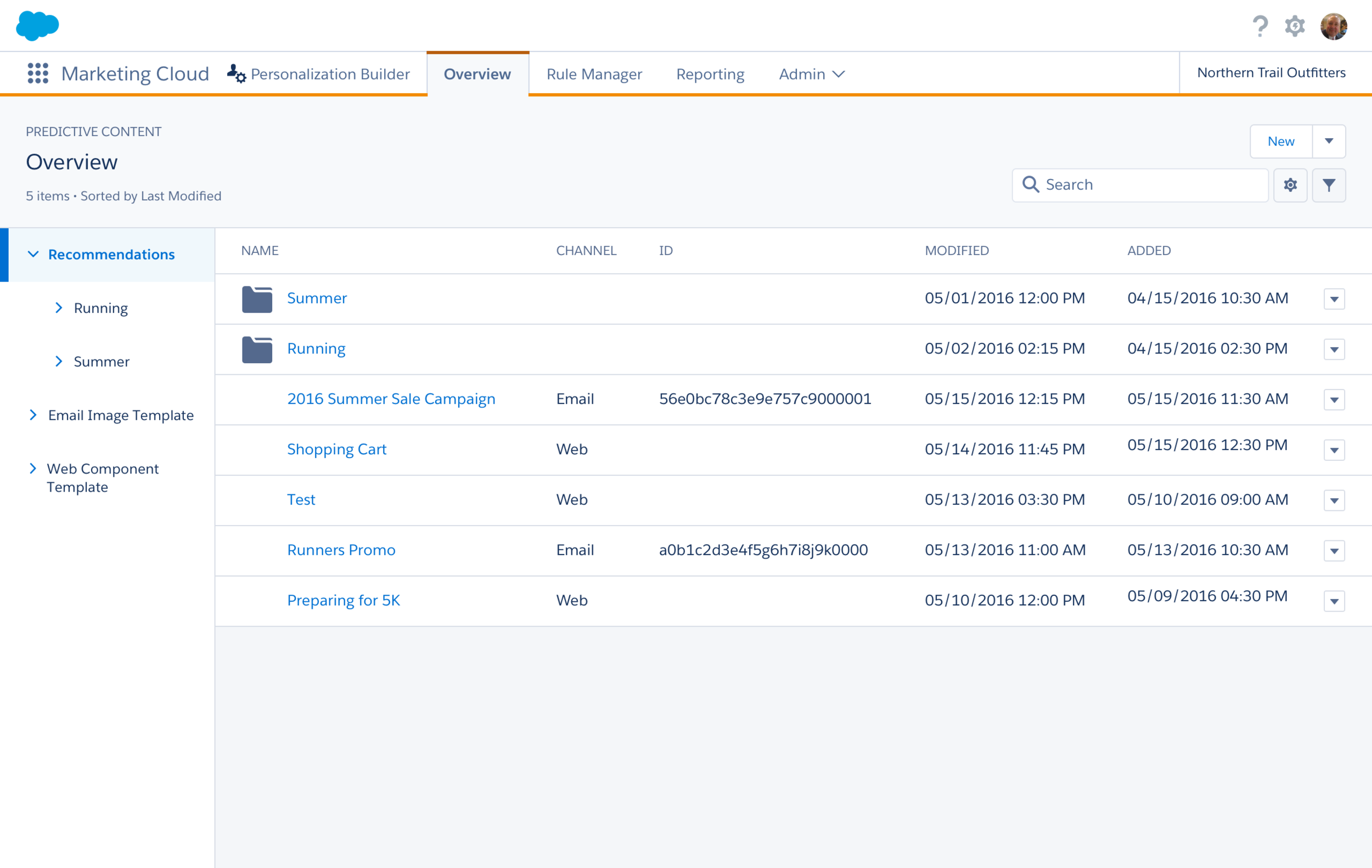
Overview - Before Predictive Email and Predictive Web were two separate products. From user feedback, we combined them into one product.
Email Image Template - "Display" was confusing to users. We created a poll to find a better alternative and "Email Image Template" was the winner. The new design is more visual compared to the old design. The old design required users to code their templates, the new design allows users to drag and drop attributes from their catalog from the left to the canvas. We still kept HTML for those who are comfortable with code. We also added additional capability, such as viewing the template with a specific item and providing a preview of the image since it may look different after image generation.
Algorithms - Before, the algorithms made no sense and users had to reference a document to understand what each algorithm was. We suggested using actual English to make it easier to understand. We also categorized algorithms so users could find the exact algorithm rather than using a dropdown like before. We also brought up some settings that were buried on the bottom and worked on help text.
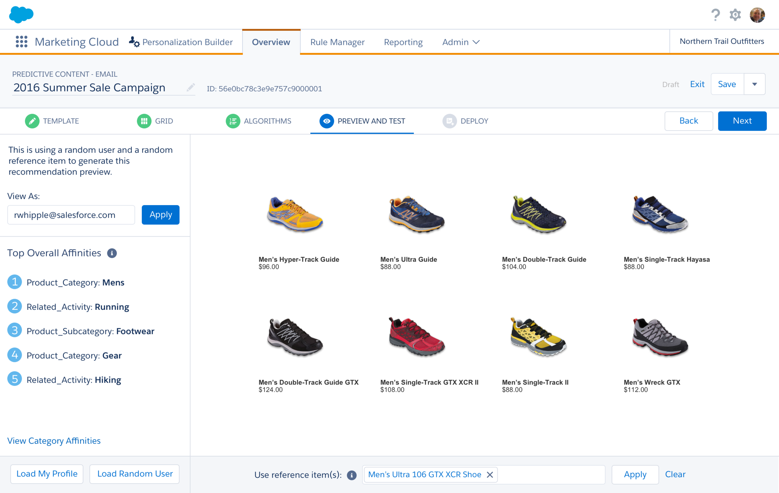
Preview - Previewing recommendations is a crucial step to our users. That is why we included this in our flow as the step before deploying the code. We added new functionality such as viewing as a specific user, being able to see the specific user's top affinities as well as category affinities, and using a different reference item. Allowing our users to test with different users and products allows users to check if our system is working successfully.
This project pushed me to design for a highly specific and technical user group—marketing professionals working within the complex ecosystem of Salesforce Marketing Cloud. I learned how important it is to balance robust functionality with a sense of ease and flow, especially when the tool’s success depends on adoption by users with varying levels of expertise.
From this project, I learned that even the most powerful features fall short if the experience isn’t intuitive. Designing for a technical audience doesn’t mean skipping the basics—in fact, it often means leaning into them even more.
1. A clear flow is critical.
Without a guided, logical flow, users can quickly feel frustrated or lost. Breaking down the Predictive Content setup into digestible steps reduced cognitive load and gave users a greater sense of progress and control.
2. Help content makes a difference.
In a product full of technical language and marketing jargon, clear support and context are essential. Providing in-product help, tooltips, and best practices made the experience feel more approachable and empowered users to move forward with confidence.
3. Language should be clear and consistent.
Terminology can easily create barriers. I focused on simplifying and standardizing language across the UI to reduce confusion. Every label, tooltip, and CTA needed to be immediately understandable—no translation required.
Finally, this project reminded me of the power of testing with real users. Conducting walkthroughs and usability tests helped me surface friction points early and design more confidently. Seeing our “step-by-step” flow resonate with users—especially when one said, “This is the easiest it’s ever been to use Predictive Content”—was a moment that really stuck with me.